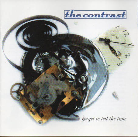
The first thing that you will notice about Forget to Tell the Time is that the cover design is slightly different than on the previous three. This design sports a new logo on a lovely white package that sports a smashed clock. Everything about the packaging says that the past should be referenced, not relived. The Contrast have taken all of the good parts from the last three albums and distilled them into one very fine 14-track album. Little Steven of Underground Garage fame has gone on record as saying that he really loves this band, and from this album it is not hard to see why. It contains that raw enthusiasm of Mystery #1, the sparkly production and introspection of Wireless Days, and the full on rock of Fade Back In. It contains elements of all these that came before it, but it is like none of them.
THE CONTRAST
FORGET TO TELL THE TIME
Rainbow Quartz
2005-10-04
“Caught in a Trap” starts the set and captures this renewed motivation perfectly. It’s a rocky little number featuring lush vocal harmonies. Andy Hawkins hammers the shit out of the drums; he and the rest of the band shout out loud the new and explicit agenda: “I’m not turning back”. In a parallel universe, the second song, “Forget to Tell the Time”, is the opening track to this album; it is that strong. It is not quite as full-on as “Caught in a Trap”, but the energy captured in it surges from the speakers.
With “Different Again” we are treated to an example of the Contrast’s hitherto overlooked quirkiness. It’s a prog-rock song filtered through early ’80s Cars and condensed into just over three and half minutes. Just when you think you know what’s going on, the song drops out of sight and is re-introduced with an acoustic middle section that is evocative of Blue Oyster Cult’s “Don’t Fear the Reaper”. When the song kicks in again, David Reid is going psycho: “Maybe I’m in love / Maybe I’m just lost / Maybe I should stop”.
“Adversity” is the first song on an album by the Contrast where someone other than Reid delivers a lead vocal. This is ostensibly a duet between Reid and new guitarist Matthew Zilch. The two serenade each other until the song disappears into a cacophony that includes, I’m told, a vacuum cleaner. This noise dissipates, leaving the dark, sinister, and almost impenetrable “Mean”. This is Reid writing material for as-yet-unscripted David Lynch films. Its space makes you feel confined in an uncomfortable manner. Like a Lynch film, its sinister-ness comes not from what is said, but what is implied.
“Someone Else’s Logo” also feels like an opener, and as a result, this sounds like the beginning of side 2. It shows Reid having a rare political moment, commenting on the general reliance on Nike trainers in order to project an image. A really nice Chris Isaak-style guitar solo sits uncomfortably in the middle. Another curveball is “Hold Your Fire”, adding a certain Tom Waits/jazz quality to the Contrast’s sound. The stars of the show here are Richard Mackman with a dog-tired, late-night-weary bass line and the accompanying solo duel from David Reid on guitar and Andy Hawkins on piano. There is something about this song that conjures Blade Runner-like scenes of rain and a dirty metropolis.
As with Mystery #1 and Wireless Days, this album finishes with a slow song. “Be There” is crying out to be in a movie at the end of Act 2 ,where the male protagonist is driving down a rainy highway thinking over his failed relationship with the female lead. Cue flashback sequence and sobbing from the audience. Andy Hawkins and David Reid take this one alone. No guitars in evidence, only piano and single vocal. It has a real frailty that brings a lump to your throat, like a good torch song should.
Since Mystery #1, the Contrast have been constantly refining their sound without losing what it is that makes them who they are. For some, this may seem like they are not breaking any new ground. This may be so, but they are so sure of what they want to be that their intention is not to burst boundaries but to be the best version of the Contrast possible. Forget to Tell the Time is, for now at least, just that.
This review debuted on popmatters.com
https://www.popmatters.com/the_contrast_forget_to_tell_the_time-2495674672.html